Forecast tones reflect a world that will be waking up and adjusting after a long period of restriction and uncertainty. As consumers find their feet, these colours will connect to feelings of optimism, hope, stability and balance.
WGSN,the global authority on consumer and design trends, and colouro, the authority on the future of colour, announced colours for Spring Summer 2023.
Our S/S 23 key colours have been chosen for a world that will be waking up and adjusting after a long period of restriction and uncertainty. As consumers find their feet, these colours will connect to feelings of optimism, hope, stability and balance. Healing habits will become part of everyday life as consumers face new challenges, and recuperation rituals will place a new focus on colours that feel restorative and supportive of physical and mental health.
--Official Statement by colouro
2023 will have major focus on Recovery.
Recovering our physical and mental Health, battered by this pandemic via organic farming and natural healing.Recovering our Economy, creating impactful businesses that drive sustainability and create a low-impact, circular economy.
People all over the world have experienced a crisis environment, and colour may be a cure across regions, nations, and cultures. The popular colours for spring and summer 2023 released this time are Digital Lavender, Sundial, Luscious Red, Tranquil Blue and Verdigris. Digital Lavender was selected as the colour of the year. The five colours are saturated colours full of positive and optimistic, emphasizing tranquility and healing. They are LUSCIOUS RED,VERDIGRIS,DIGITAL LAVENDER,SUNDIAL,,TRANQUIL BLUE. And a brief introduction of these colors as below.
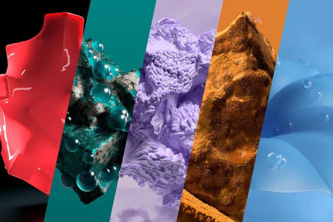
LUSCIOUS RED
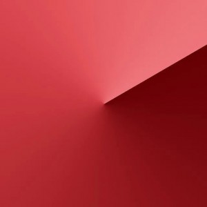
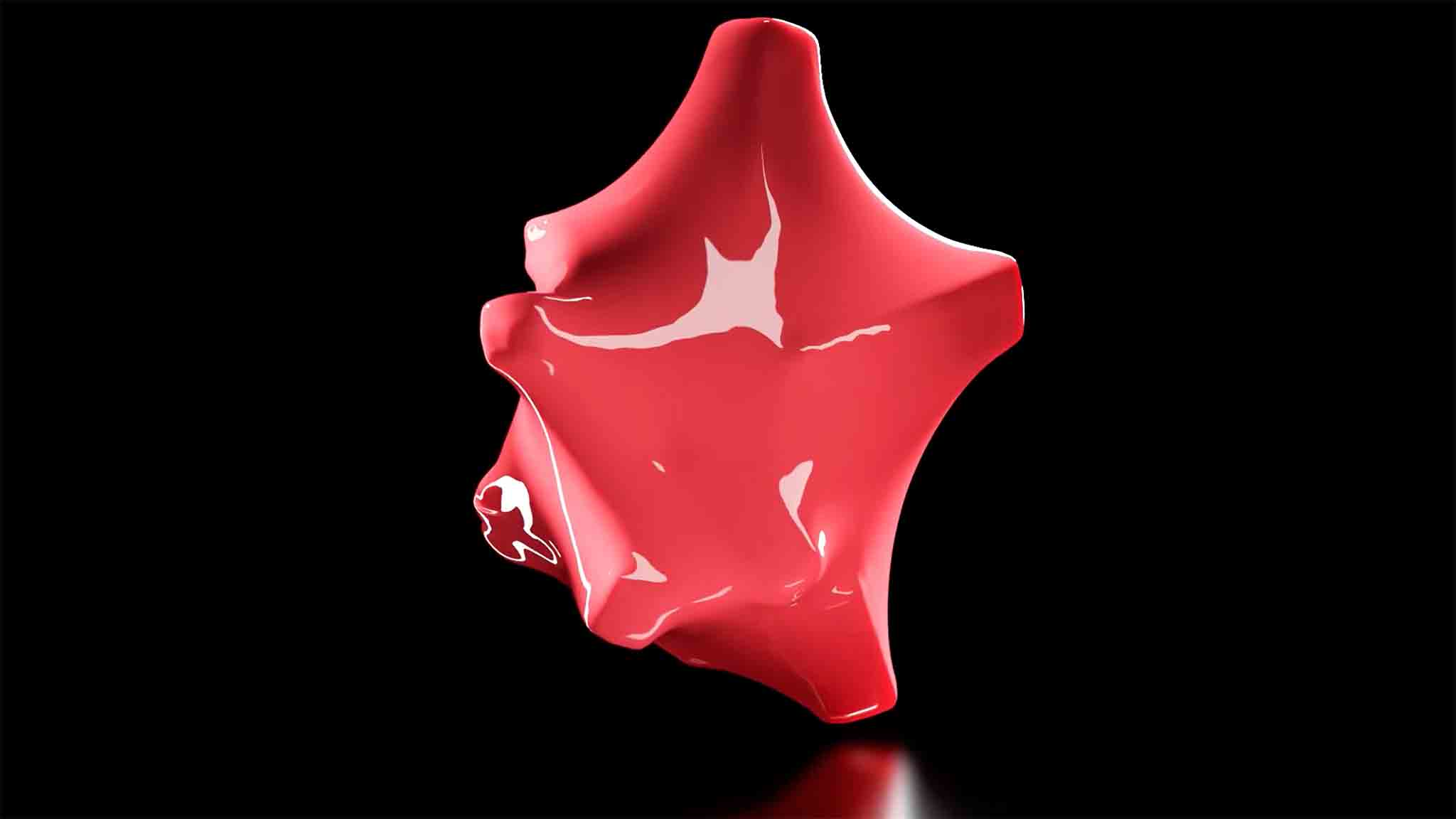
Charm Red is the brightest of the five colours and is full of excitement, desire and passion. This will be a desired colour in the real world.
VERDIGRIS
The patina is extracted from oxidized copper, with shades between blue and green, reminiscent of sportswear and outdoor gear in the 80s, and can be understood as aggressive and youthful energy.

DIGITAL LAVENDER
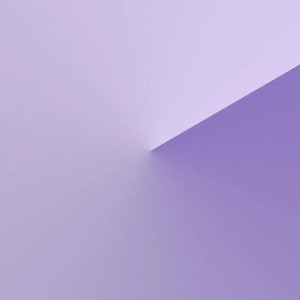
Following the warm yellow of 2022, digital lavender was chosen as the colour of the year for 2023, it represents health, has a stabilizing and balancing effect on mental health, and research shows that colours with shorter wavelengths, such as digital lavender, can evoke calm.
SUNDIAL
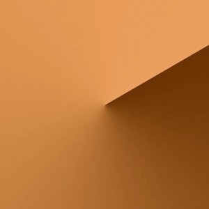
Organic, natural colours reminiscent of nature and countryside. With growing interest in craftsmanship, sustainability and a more balanced lifestyle, shades that are naturally derived from plants and minerals will be hugely popular.
TRANQUIL BLUE
Tranquility Blue is about the elements of air and water in nature, expressing a calm and harmonious state of mind.

For more details,Let's look at details of the 5 Key declared colours for Spring Summer 2023 :
DIGITAL LAVENDER colouro: 134-67-16
Stability • Balancing • Healing • Wellbeing
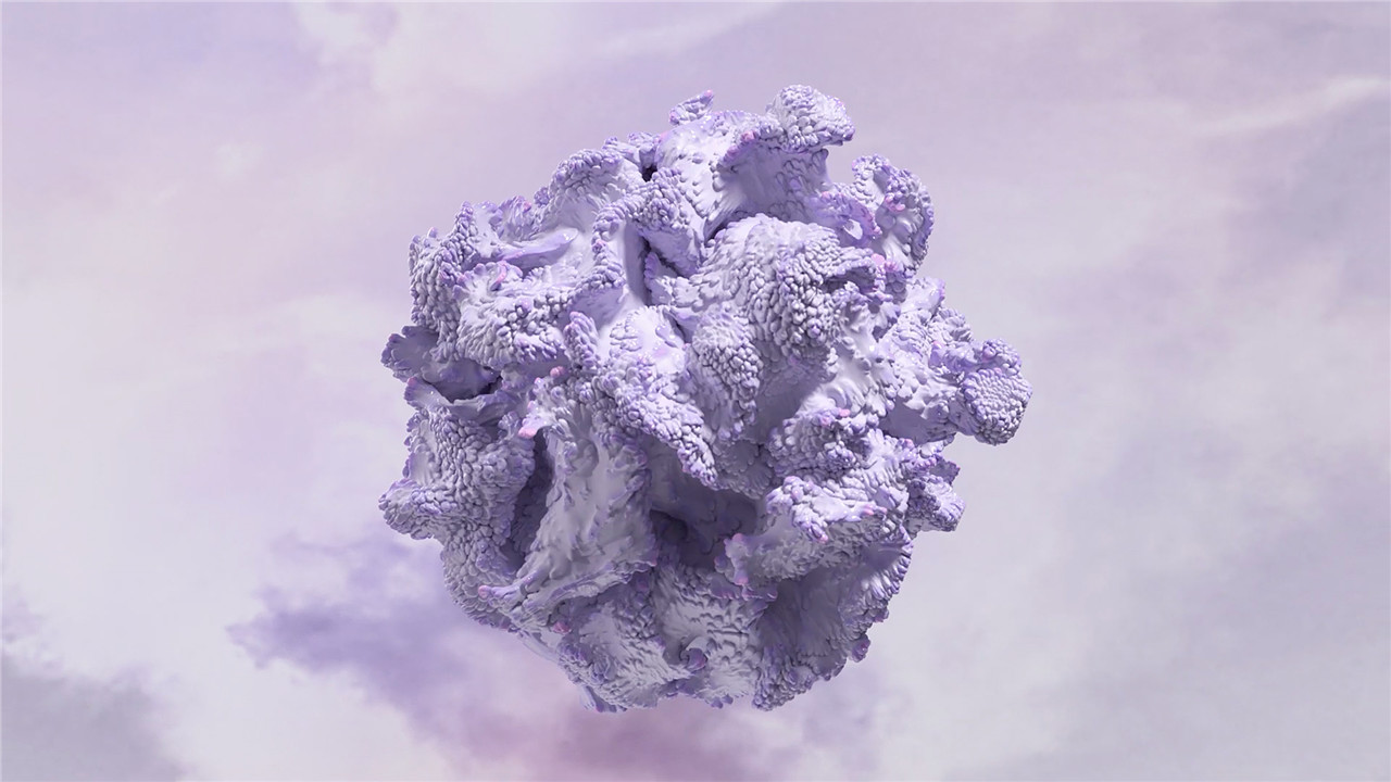
Purple is a colour,representing wellness and digital escapism magic, mystery, spirituality, subconscious, creativity,royalty,will return as a dominant colour for the coming 2023. And Recuperative rituals will become a top priority for consumers who tend to look for colours that they can relate to positively,hopeful etc.And Digital Lavender will connect to this focus on wellbeing,providing a sense of balance and stability . Studies suggests that colours with a shorter wavelength, such as Digital Lavender, evoke calmness and serenity meanings more than any other shade colours. Already embedded in digital culture, we expect this imaginative colour to converge across virtual and physical worlds. In fact, Digital Lavender already established in the youth markets, and we expect it will broaden into all fashion product categories by 2023. Its sensorial quality makes it ideal for self-care rituals, healing practices and wellness products, and this purple will also be key for consumer electronics, digitized wellness, mood-boosting lighting and homewares.
SUNDIAL | Coloro: 028-59-26
Organic • Authentic • Humble • Grounded
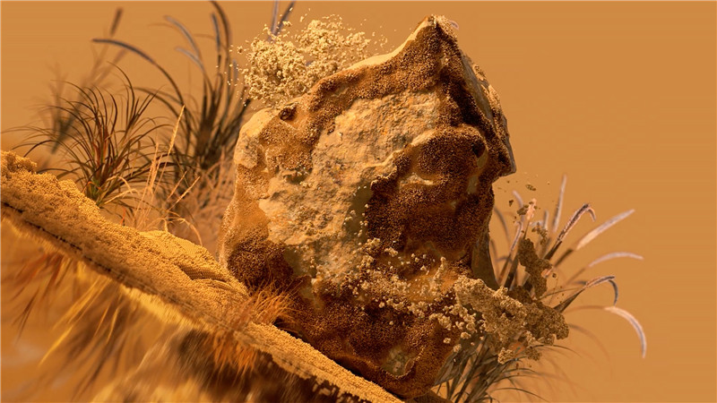
As consumers re-enter the countryside, organic colours from nature are still very important, coupled with growing interest in craftsmanship, community, sustainable and more balanced lifestyles, sundial yellow in earth tones will be Be loved.
How to use it: Sundial Yellow works in many categories, but for clothing and accessories, pair it with a neutral colour or elevate it with bright gold. If used in make-up, it is recommended to increase the gloss for an earthy metallic colour. When used to create home hard surfaces, paint colours or textile fabrics, care should be taken to retain the simple and quiet character of Sundial Yellow.
LUSCIOUS RED| Coloro: 010-46-36
Hyper-Real • Immersive • Sensorial • Energy
WGSN and colouro jointly predict that purple will return to the market in 2023, becoming the colour of physical and mental health and the extraordinary digital world.
Studies have shown that colours with shorter wavelengths, such as purple, can evoke inner peace and tranquility. The digital lavender colour has the characteristics of stability and harmony, echoing the much-discussed theme of mental health. This colour is also deeply integrated into the marketing of digital culture, full of imagination space, diluting the boundary between the virtual world and real life.
The unisex digital lavender colour will be the first to gain favor in the teenage market, and will be further extended to other fashion categories. Digital lavender is sensual and ideal for self-care, healing and wellness products, as well as for home appliances, digital health products and experiences, and even homeware design.
In addition to the digital lavender colour, the other four key colours: Charm Red (colouro 010-46-36), Sundial Yellow (colouro 028-59-26), Serenity Blue (colouro 114-57-24), patina (colouro 092- 38-21) was also released at the same time, and together with the digital lavender colour constitute the five key colours of spring and summer 2023.
TRANQUIL BLUE| Coloro: 114-57-24
Calm • Clarity • Still • Harmonious
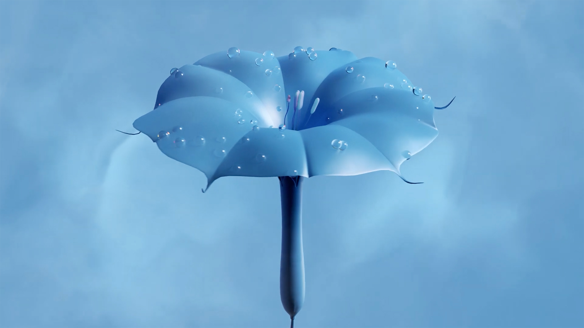
In 2023, blue remains crucial, with a focus on moving towards brighter mid-tones. As a colour closely related to the concept of sustainability, Tranquility Blue is light and clear, easily reminiscent of air and water; in addition, the colour also symbolizes tranquility and tranquility, which helps consumers fight against depression.
Recommendations for use: Tranquility blue has emerged in the high-end women's clothing market, and in the spring and summer of 2023, this colour will inject modern new ideas into medieval blue and quietly penetrate into major fashion categories. When it comes to interior design, Tranquility Blue is recommended for large areas, or paired with a calming neutral; it can also be used as a bright pastel shade to rejuvenate avant-garde make-up and eco-friendly beauty product packaging.
VERDIGRIS| Coloro: 092-38-21
Retro • Invigorating • Digital • Test of time
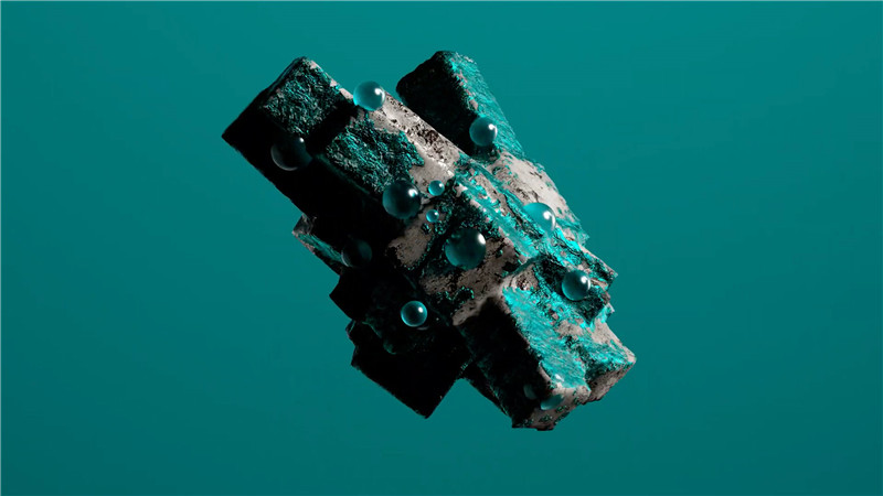
patina is a saturated colour between blue and green with a faintly vibrant digital feel the tones are nostalgic often reminiscent of sportswear and outdoor clothing from the 80s over the next few seasons verdigris will evolve into a positive vibrant hue suggestions for use as a new colour in the casual and streetwear market verdigris is expected to further unleash its appeal in 2023 it is recommended to use copper green as a cross-season colour to inject new ideas into major fashion categories in terms of beauty you may wish to take the opportunity to launch beauty products in avant-garde and bright colours for retail spaces personalized furniture and decorative accessories eye-catching and unique charming patina is also a good choice.
Spring-Summer 2023 sees a massive movement in colour from the 2022 palettes. The colour of the Year 2022, Orchid Flower passes on the baton to Digital Lavender, which shows the continuation of purple as a prime influencer.
The Yellow story gets more grounded and earthy, moving from vibrant Mango tones to Sundial. We predict the AW 23/24 palette to feature a warmer, deeper yellow going towards more earth tones/browns.
The Blue story continues to be popular, but grows lighter and brighter because we seek better times. The deepness of the Atlantic Ocean and Lazuli is fading out, as we transition to tranquil, clearer waters.
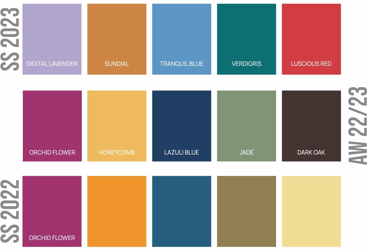
The Green story, on the other hand, is losing it's yellow tinges and becoming more an dmore powerful and dominant as a pure green hue. The inspiration for Green continues to come from natural sources, but moving towards turquoise and cold greens.
The big colour making a comeback is Luscious Red, which has already been gaining immense popularity in Fashion and Home. The showstopper colour in the SS 2023 palette, Red is definitely here to stay, and we will definitely be expecting a deeper hue in the AW 23/24 key colours.
Post time: Nov-16-2023


